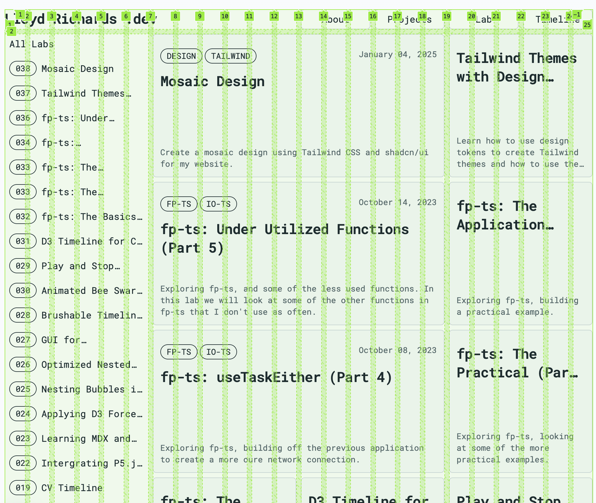
For my website redesign, I want to create a mosaic design using Tailwind CSS. To recycle as much of the existing design as possible, my idea is to create a flexible grid system that can be used to create a bento-style layout.
A bento-style layout is a design approach inspired by the compartmentalized structure of a bento box. In this layout, the webpage is divided into distinct, modular sections (or "compartments") that serve as containers for different types of content. Each compartment is neatly organized, creating a visually balanced and cohesive presentation.
Design Concept
To make things responsive and flexible, I'm using a 12-column grid system with
three breakpoints: sm, md, and lg. But in order to be more flexible with
extra small components, I'm going to double up the columns and rows:
sm(small): 4 columns (8 columns)md(medium): 8 columns (16 columns)lg(large): 12 columns (24 columns)
lg (> 1024px)
----┳----┳----┳----┳----┳----┳----┳----┳----┳----┳----┳----┳----┳----
    ┃  1 ┃  2 ┃  3 ┃  4 ┃  5 ┃  6 ┃  7 ┃  8 ┃  9 ┃ 10 ┃ 11 ┃ 12 ┃
    ┣----╋----╋----╋----╋----╋----╋----╋----╋----╋----╋----╋----┫
    ┃    ┃    ┃    ┃    ┃    ┃    ┃    ┃    ┃    ┃    ┃    ┃    ┃
    ┣----╋----╋----╋----╋----╋----╋----╋----╋----╋----╋----╋----┫
    ┃    ┃    ┃    ┃    ┃    ┃    ┃    ┃    ┃    ┃    ┃    ┃    ┃
    ┣----╋----╋----╋----╋----╋----╋----╋----╋----╋----╋----╋----┫

md (> 768px)
    ┏----┳----┳----┳----┳----┳----┳----┳----┓
    ┃  1 ┃  2 ┃  3 ┃  4 ┃  5 ┃  6 ┃  7 ┃  8 ┃
    ┣----╋----╋----╋----╋----╋----╋----╋----┫
    ┃    ┃    ┃    ┃    ┃    ┃    ┃    ┃    ┃
    ┣----╋----╋----╋----╋----╋----╋----╋----┫
    ┃    ┃    ┃    ┃    ┃    ┃    ┃    ┃    ┃
    ┣----╋----╋----╋----╋----╋----╋----╋----┫

sm (< 768px)
    ┏----┳----┳----┳----┓
    ┃  1 ┃  2 ┃  3 ┃  4 ┃
    ┣----╋----╋----╋----┫
    ┃    ┃    ┃    ┃    ┃
    ┣----╋----╋----╋----┫
    ┃    ┃    ┃    ┃    ┃
    ┣----╋----╋----╋----┫
These boxes are then used as the base for creating and aligning elements on the
page. Using the gap utility class, I can create a consistent spacing between
the elements, while using the col-span-* utility class to define the size of
the elements.
md (> 768px)
    ┏-----------------------------┳-----┳-----┳-----┓
    ┃  logo                       ┃ nav ┃ nav ┃ nav ┃
    ┣-----┳-----------------------┻-----╋-----┻-----┫
    ┃ nav ┃                             ┃           ┃
    ┣-----┫           box-md            ┃ square-md ┃
    ┃ nav ┃                             ┃           ┃
    ┣-----╋-----------┳-----------------┻-----------┫
    ┃ nav ┃           ┃                             ┃
    ┣-----┫ square-md ┃           box-md            ┃
    ┃ nav ┃           ┃                             ┃
    ┣-----╋-----------┻-----------------┳-----------┫
Implementation
Initially, I'll create a basic grid system using CSS and planned to use the
subgrid feature to create the various parts of the elements. However it became
clear that the collapsible nature of the grid system would be difficult to work
with expanding content, better used with a flex system. The solution was a
combination of Tailwind utility classes and subgrid which could be implemented
when flexbox was not needed:
@theme inline {
  --grid-auto-rows-lg: calc(
    min(100vw, var(--container-6xl)) / 24 - var(--spacing) * 48 / 23
  );
  --grid-auto-rows-md: calc(100vw / 16 - var(--spacing) * 32 / 15);
  --grid-auto-rows-sm: calc(100vw / 8 - var(--spacing) * 16 / 7);
}

@utility mosaic-rows {
  @apply auto-rows-sm md:auto-rows-md lg:auto-rows-lg gap-2;
}

@utility mosaic-columns {
  @apply grid-cols-8 gap-2 md:grid-cols-16 lg:grid-cols-24;
}
Calculating the grid-auto-rows based on the viewport width and the number of
columns, I can create a responsive grid system that can be used to create a
mosaic design. The mosaic-rows and mosaic-columns utility classes can be
used to apply the grid system to any element, and when combined with the
subgrid it makes sure everything is aligned correctly.

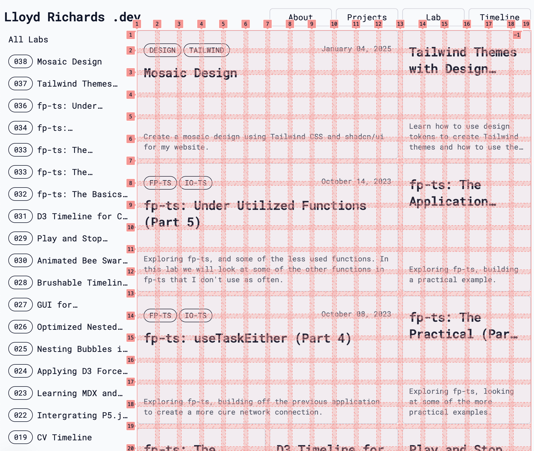
The resulting structure looks like this:
<body className="mosaic-columns grid">
  <head className="col-span-full grid-cols-subgrid mosaic-rows grid" />
  <main className="col-span-full grid-cols-subgrid grid">
    <aside className="col-span-4 mosaic-rows grid" />
    <article className="col-[7/-1] mosaic-rows grid-cols-subgrid grid" />
  </main>
  <footer />
</body>
Where the <article /> element is using the subgrid and mosaic-rows
utilities to create the aligned grid system. From here all the Tile components
can be added to create the mosaic design:

Tile components
From this system its possible to create Tile components that can be used to
wrap content and create a mosaic design. These tiles can be responsive too, with
the ability to change the number of columns and rows based on the screen size.
| Tile Size | sm | md | lg |
|---|---|---|---|
box-xxs | 1x1 | 2x1 | 3x1 |
box-xs | 2x1 | 4x2 | - |
box-md | 8x4 | 10x5 | 12x6 |
square-xxs | 1x1 | 2x2 | 3x3 |
square-xs | 1x1 | 2x2 | 3x3 |
square-md | 4x4 | 4x4 | 6x6 |
Using the @container feature of CSS, I can create multiple layouts for content
that is able to adapt to the available space. This allows for a more flexible
design that can be used to create a variety of different layouts. The example
above shows how the same LabCard component can be used to create different
layouts based on if its a square or a box.
Conclusion
Creating a mosaic design using Tailwind CSS is a great way to add visual
hierarchy to a website. By using a flexible grid system, I can create a
bento-style layout that is responsive and easy to maintain. This design helps as
a base for future ideas such as having Tiles that expand when clicked and taking
more advantage of the @container features of CSS. `;